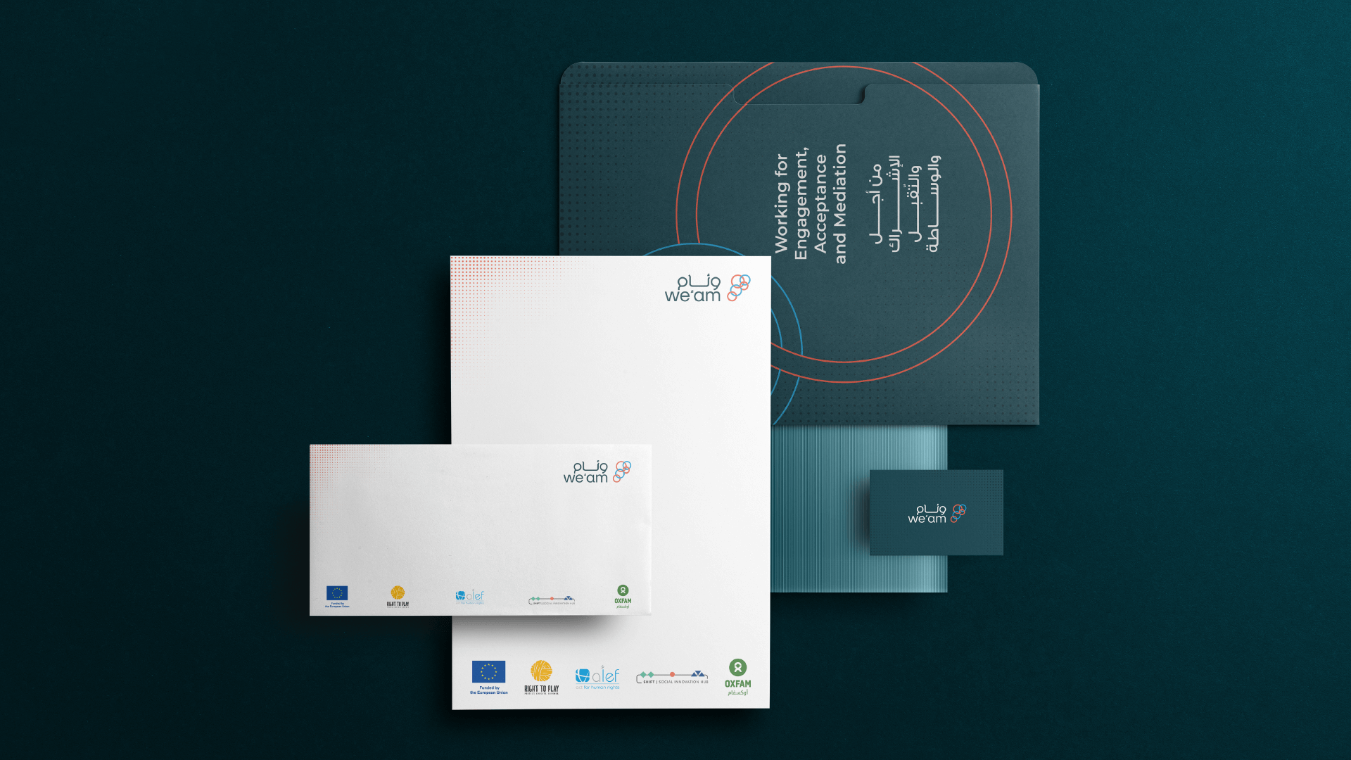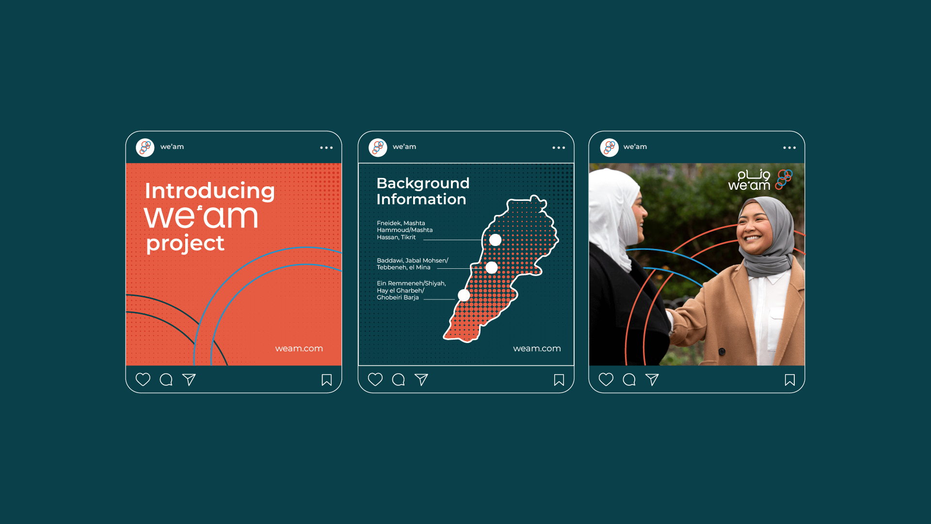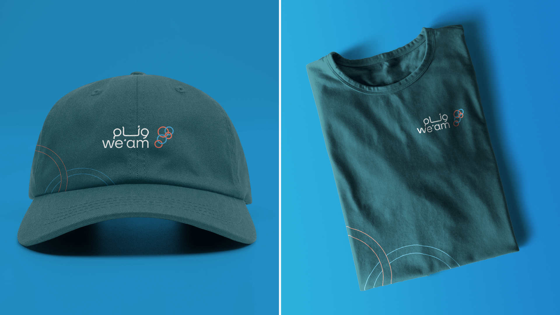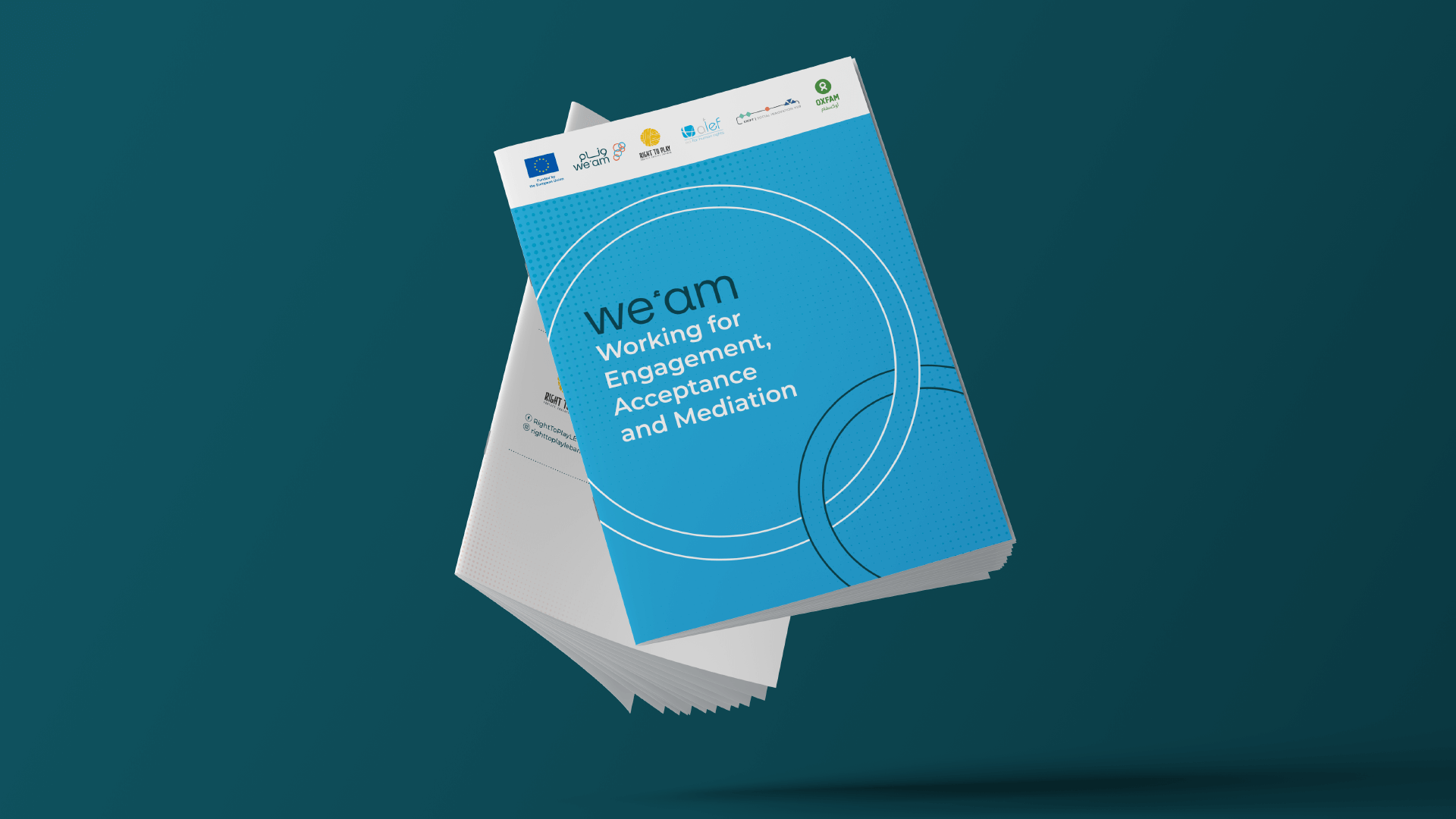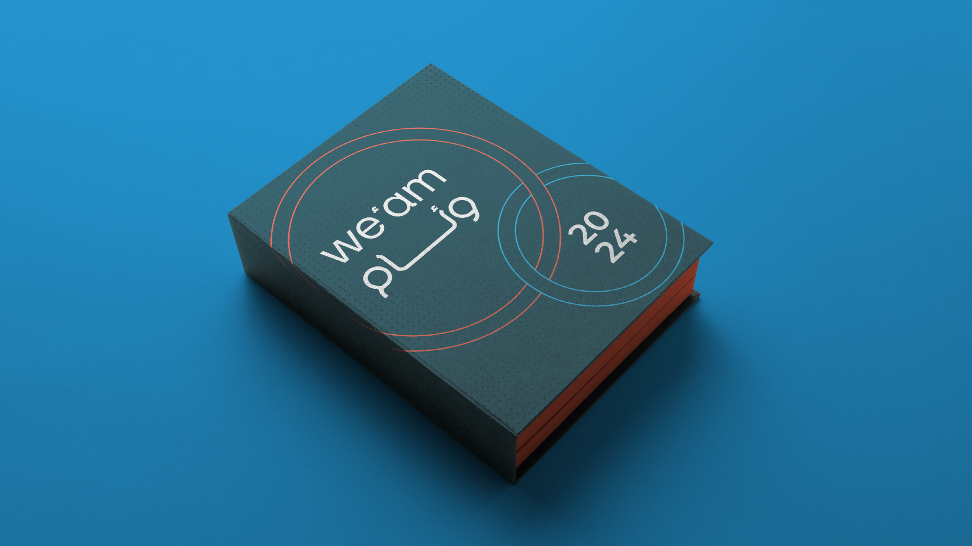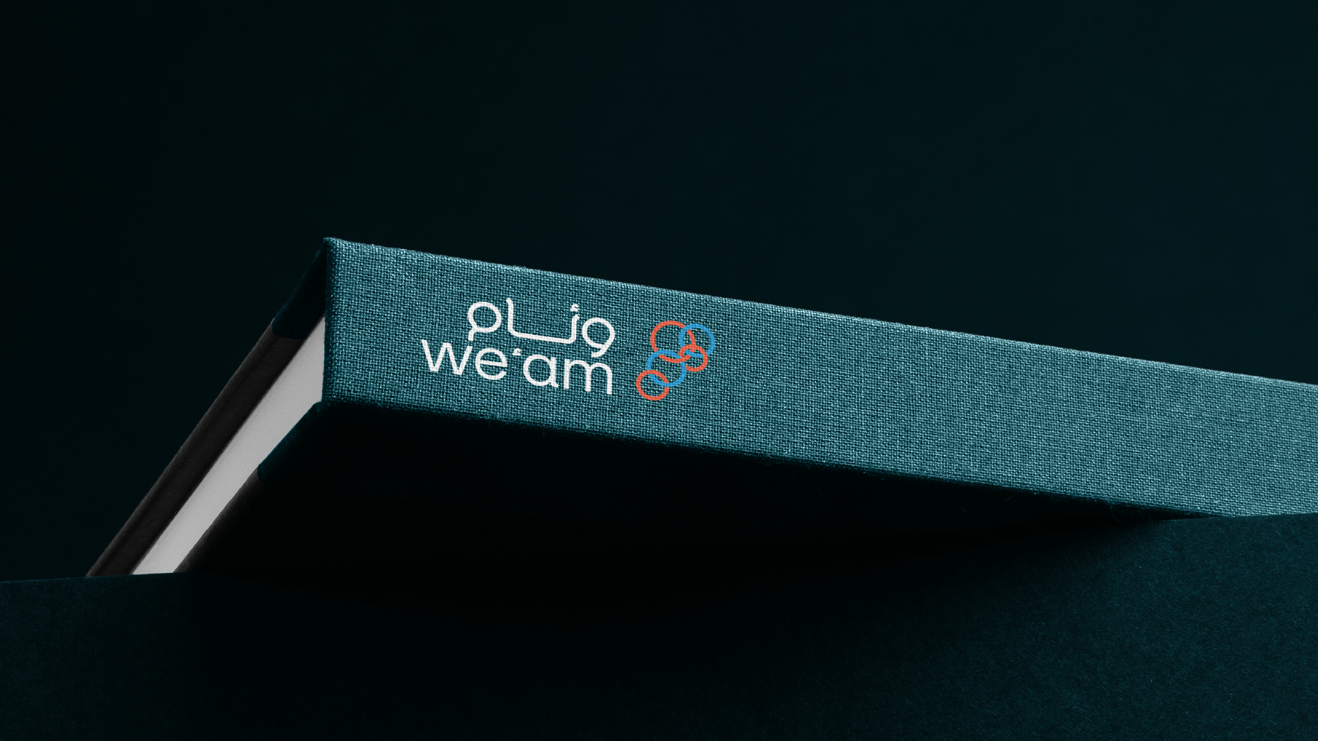
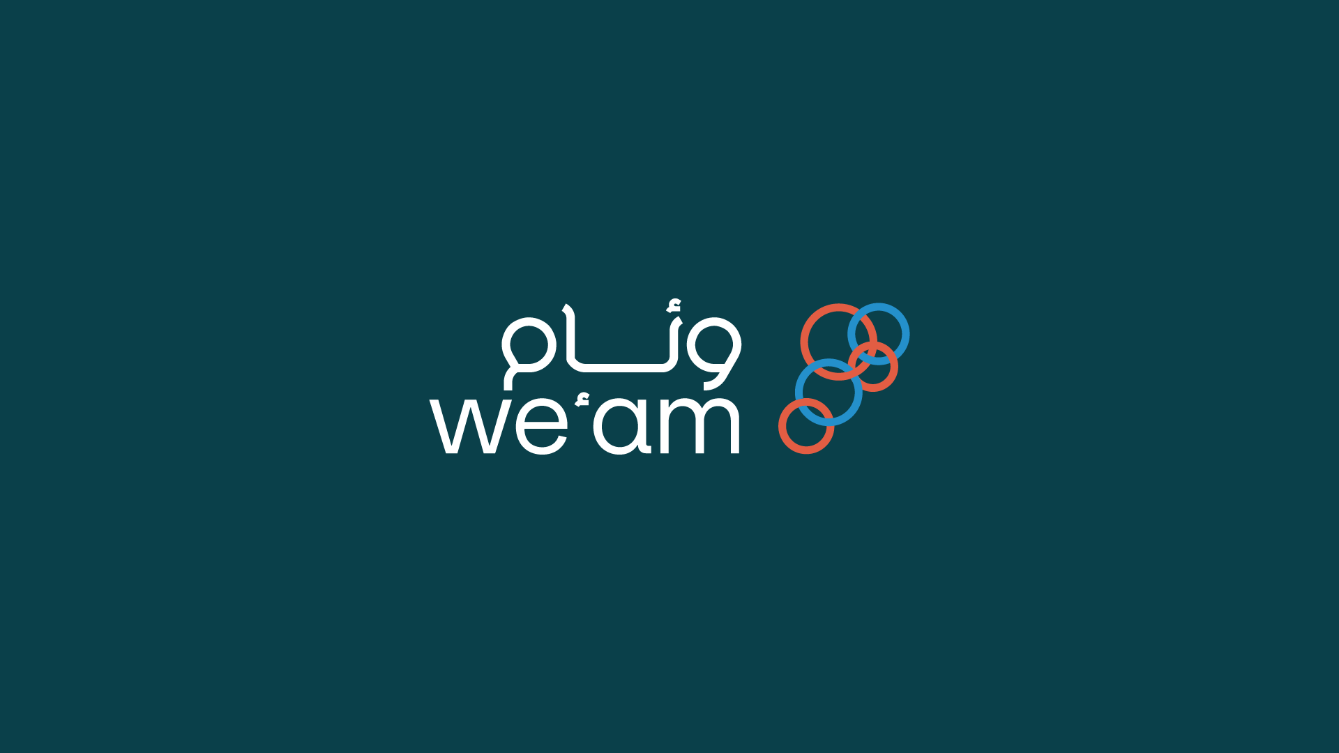
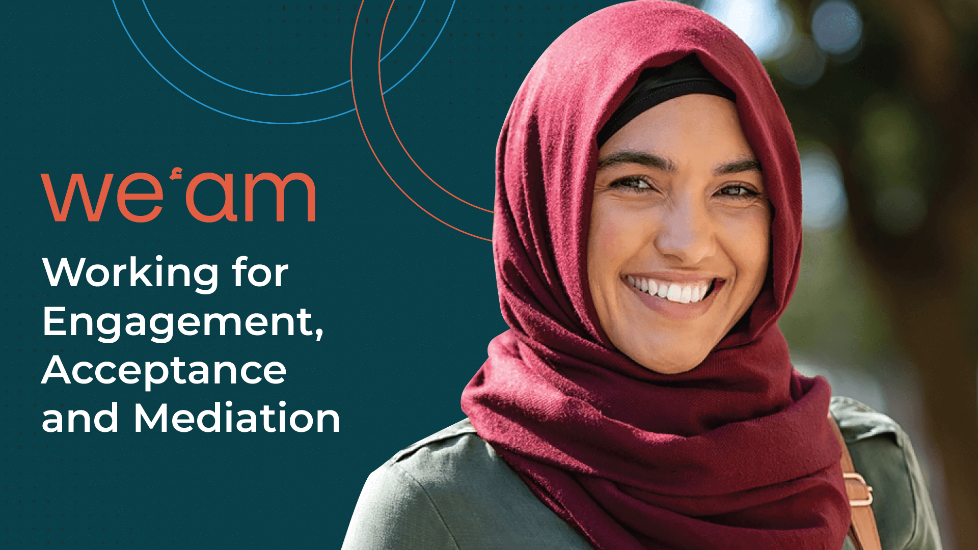
We'am
“We’am,” meaning inclusion in Arabic, is a logo designed to visually represent the values of unity, diversity, and inclusivity. The logo’s central icon is a stylized map of Lebanon, cleverly crafted using interconnected circles to symbolize the strength found in diversity and the interconnectedness of individuals within a community.
Scope: Brand Identity
Industry: Non governmental organisation
Location: Lebanon
Design Notes*
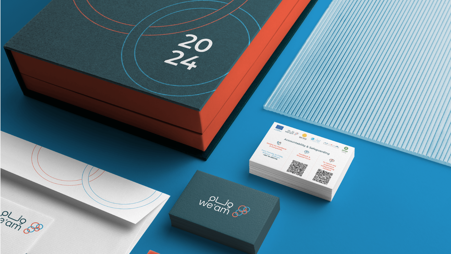
The design features a map of Lebanon to highlight local context and community identity, reflecting a commitment to unity within the country’s cultural and geographical landscape. Interwoven circles within the map represent the interconnectedness of diverse backgrounds, showing that unity comes from embracing differences. The color palette includes dark turquoise for sophistication, stability, and trust; light blue for tranquility and open communication; and red orange for warmth, energy, and passion, underscoring the commitment to an inclusive community where individuals feel empowered and engaged.
Brand Goals*
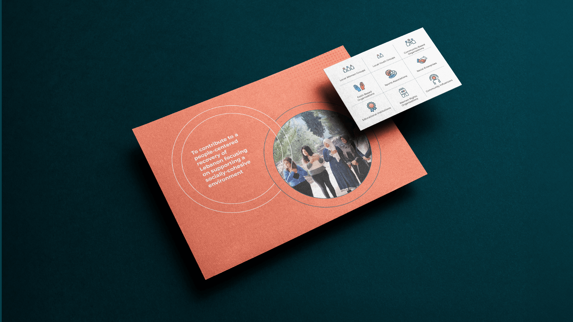
The “We’am” logo aims to evoke a sense of pride and belonging, encouraging individuals to embrace their unique identities while appreciating the rich tapestry of diversity within the Lebanese community. The design communicates a message of unity, equality, and the collective strength that arises when different elements come together.